

Color Blocking Furniture and Lighting: Build a Cohesive Palette
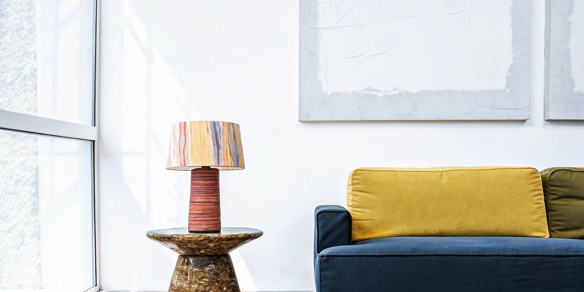
A room can be colorful without feeling chaotic. The difference is usually not how many hues you choose, but how deliberately you repeat, balance, and place them across the space. A bright chair, a sculptural lamp, and a painted wall can feel like one confident composition when they share a clear visual logic.
Explore the Woaw Lighting Collection , sculptural, color-blocked lamps designed to anchor any room's palette with personality and balance.
To make color blocking furniture and lighting feel cohesive, choose a small palette, assign each color a role, and repeat those colors at different scales. Let one piece carry the strongest contrast, then support it with quieter surfaces, related accents, and enough breathing room for the shapes to read.
Lighting is especially useful because it adds color at eye level while also shaping the room after sunset. Bold, sculptural forms can bring a dopamine decor and color-blocking energy to an otherwise restrained interior, but cohesion comes from the relationship between hue, proportion, material, and visual weight. Start by defining what your palette needs to do, then build the furniture and lighting around that shared idea.
Color Blocking Furniture And Lighting: What Makes a Color-Blocking Palette Cohesive Across Furniture and Lighting?
A cohesive color-blocking palette does not mean every object matches. It means the colors, proportions, and visual intensity feel intentional when they share a room. Furniture can carry the broadest blocks, while a lamp adds a concentrated accent at eye level. The result is expressive without becoming visually noisy.
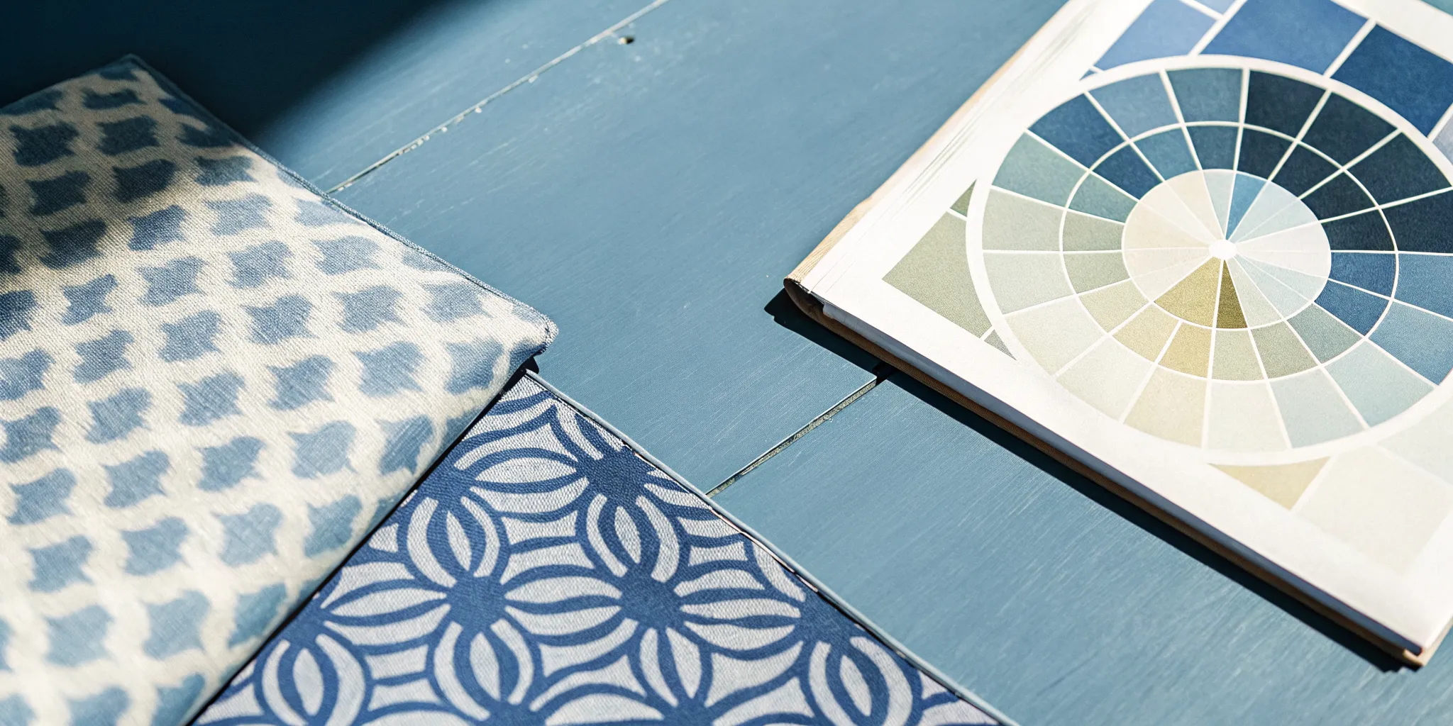
Choose a color relationship with a clear mood
Start by deciding how much contrast the room can handle. Complementary schemes pair hues directly opposite each other on the color wheel, such as blue and orange. That opposition creates a vibrant, high-energy effect, making it useful when a sofa, chair, or sculptural lamp should feel like a lively focal point. Warm colors such as red, orange, and yellow tend to stimulate energy and appetite, so they can make social spaces feel active and welcoming. Interior color theory offers a useful foundation for choosing that level of contrast.
For a quieter composition, use an analogous scheme. It brings together three to five neighboring hues, such as blue-green, green, and yellow-green. Because the colors are related, furniture and lighting can vary without competing. This approach suits a bedroom, reading corner, or any space where you want color with a calmer pulse. Cool colors such as blue, green, and lavender generally promote relaxation and focus.
A triadic scheme sits between those two moods. It selects three colors evenly spaced around the color wheel, giving the room both variety and balance. For example, one color might appear on an armchair, another on a side table, and the third in a lamp shade or small accessory. Keep one hue dominant and let the other two act as supporting notes. That hierarchy stops a balanced palette from becoming a three-way shouting match.
Use value and saturation to control visual weight
Hue is only part of the decision. Value describes how light or dark a color is, while saturation describes how intense or muted it appears. A dark, fully saturated block pulls more attention than a pale, dusty version of the same hue. If the furniture is already visually heavy, a lighter or less saturated lamp can provide color without adding another dense focal point. Conversely, a vivid shade can wake up a neutral chair and make the lighting feel integrated rather than incidental.
Test the palette in grayscale before committing. If every piece becomes equally dark, the room may feel crowded even when the hues look attractive on a screen. Give the eye a resting value, then repeat one accent color in smaller doses across the room. This is the design logic behind playful Gen Z home decor trends: personality works best when contrast has structure. The goal is not perfect matching. It is a conversation between shape, color, and light.
How to Anchor a Color-Block Palette With a Single Lamp
Think of a statement lamp as the room's spark. Instead of matching every cushion, chair, and artwork to one another, let one sculptural piece establish the color story first. A bold silhouette with clear blocks of contrasting color gives the eye somewhere to land, then makes the rest of the room easier to edit. This is color blocking with lighting at its most useful: expressive, intentional, and far less complicated than it looks.
The Woaw Lighting Collection is designed to do exactly that. Its lamps use steel bodies and ceramic shades, allowing distinct color-blocked sections to live within a single object. That material contrast gives the color more definition. A saturated shade can feel crisp against a differently colored body, while the sculptural form keeps the piece from reading like a plain lamp with a bright finish.
Start with the lamp, then pull the palette outward
Place the lamp where it can act as a visual anchor: beside a sofa, on a console. At the end of a dining table, or in a reading corner that needs more personality. Let its strongest hue guide one or two supporting choices elsewhere in the room. You might repeat a shade color in a small cushion, echo the body tone in a side table, or choose an artwork that shares the same visual temperature. The repetition should feel like a wink, not a uniform.
Keep larger surfaces calmer if the lamp is especially vivid. A neutral wall, natural wood, or softly toned upholstery creates breathing room around the color blocks. If the surrounding room already has plenty of pattern, use the lamp's shape as the anchor and repeat only one color. The aim is not to make every object compete. It is to give the room a clear point of view.
Make the anchor practical as well as expressive
A statement piece still has a job to do after the compliments. Woaw lamps feature integrated LEDs, so the light source is built into the design rather than treated as an afterthought. Universal 120V-240V compatibility and US, UK, and EU plug options also make the collection versatile across spaces and locations. That flexibility lets the same design language travel from a bedroom or living room to a globally minded retail, hospitality, or creative setting.
These pieces are available by pre-order and ship within a 60-day production window. That wait supports the handcrafted quality behind the steel-and-ceramic construction, so plan the lamp as an intentional addition rather than an impulse filler. For more ideas on choosing a statement piece for a room, use this colorful floor lights buying guide. The best anchor is the one that brings function, color, and a little joy into the same frame.
Color Blocking Rules: Contrast, Repetition, and Proportion
Color blocking feels intentional when every bright moment has a job. Start with three rules: use contrast to create energy, repetition to create a visual thread, and proportion to keep the room from shouting over itself. These principles apply just as much to a cobalt armchair and saffron rug as they do to a sculptural lamp with a painted body and shade.
1. Use contrast for the visual pop
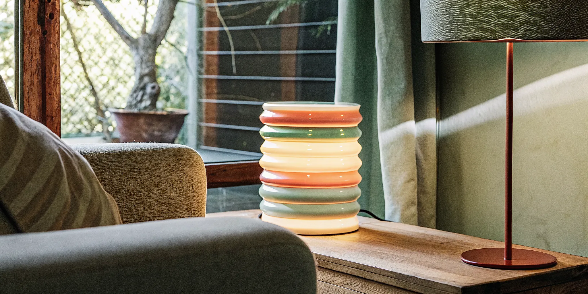
Contrast is the quickest way to make a color-blocked room feel alive. Complementary colors sit opposite each other on the color wheel, such as blue and orange, and create a high-energy pairing. You do not need to cover half the room in each hue. A rust cushion against a blue sofa, or a warm lamp beside a cool-toned wall, can be enough to make both elements look sharper.
Contrast also includes light and dark, not only hue. A pale ceramic shade against a saturated steel body creates a clear visual split. While a dark lamp on a light side table gives the piece a crisp silhouette. When selecting color blocking furniture and lighting, ask what each item is meant to stand apart from. If every surface is equally bright, nothing gets the spotlight.
2. Repeat a color to make bold choices feel connected
Repetition turns separate purchases into a composition. Echo one color at least twice elsewhere in the room, but vary the material or scale so the result feels collected rather than matched. A green chair might relate to a small green detail in artwork and a glass accent on a shelf. A coral lamp can speak to a warm throw, vase, or book spine without requiring a coral-colored room.
For a calmer scheme, choose analogous colors that sit next to one another on the color wheel. Blue, blue-green, and green offer variation without the hard snap of opposites. This approach works especially well when furniture supplies the larger color fields and lighting adds a smaller, more sculptural repeat. For more inspiration, explore maximalist home decor that uses repetition without flattening personality.
3. Let proportion control the visual weight
A useful starting point is the 60-30-10 rule: roughly 60 percent of the room carries the dominant color, 30 percent supports it, and 10 percent provides the accent. Treat those numbers as a guide, not a law. The dominant color might live in walls and a sofa, the supporting shade in a rug and chairs. And the accent in a lamp, artwork, or a single side table.
Before choosing exact hues, map the room in values, meaning its light-to-dark distribution. Professional colorists at firms such as Gensler and HKS often map value distributions before committing to specific colors, so the light-dark structure works first. You can do the same with a quick phone photo converted to grayscale. If all the furniture and lighting land in the same value range, add a darker anchor or a lighter counterpoint before introducing another saturated hue.
Value and saturation determine how heavy a color feels. Fully saturated primaries across every major surface can overwhelm, while dusty versions of those hues may feel more settled. Keep the largest furniture pieces controlled, then let lighting deliver the playful punctuation. That balance gives bold choices room to shine without turning the space into visual static.
Why Steel-and-Ceramic Lighting Holds Bold Color Without Overpowering the Room
Color blocking works best when the color has a clear architectural job. A bright body, contrasting shade, or carefully repeated accent can make a room feel expressive without turning every surface into visual noise. Material matters here. The separation between a steel body and ceramic shade gives each color its own defined zone. So the lamp reads as a sculptural object rather than one loud block.
| Material | Color Blocking Potential | Visual Weight | Durability | Price Range |
|---|---|---|---|---|
| Woaw (steel body + ceramic shade) | Distinct body-and-shade segments support bold, saturated color with intention. | Sculptural and substantial, but visually balanced by the two-part form. | Handcrafted steel and ceramic construction, produced within a 60-day window. | $282-$491 for Woaw table and wall lamps |
| Standard metal lamp | Often relies on one finish, making the look more monochromatic. | Clean and streamlined, though a single solid finish can feel visually flat. | Can be dependable, but quality varies significantly by construction and finish. | Varies by manufacturer and specification |
| Plastic or molded lamp | Can offer bright color, but molded forms may not create the same material contrast. | Usually lighter and more casual, with less visual depth. | Finishes may chip, scratch, or fade with use, depending on the material and coating. | Varies widely |
The point is not that every metal or plastic lamp is a bad choice. It is that the construction sets the ceiling for the design. A monochromatic metal fixture can disappear into a restrained scheme. While a molded plastic piece may deliver a quick hit of color without the tactile presence of a considered object. Steel and ceramic create contrast before you even choose the palette.
That makes the material pairing especially useful for dopamine decor. Bold color feels more edited when it is organized by form, and a sculptural silhouette gives saturated hues somewhere to land. The result is playful, but not chaotic: a little design mischief with a solid foundation. Explore the Woaw Lighting Collection to see how simple things can bring big vibes to a room.
Woaw table and wall lamps range from $282 to $491, placing handcrafted materials in an accessible luxury space. Because each piece is made to order, allow a 60-day production window rather than expecting immediate shipment. That wait is part of the proposition: less disposable color, more deliberate character.
Building a Color-Blocked Living Room: A Step-by-Step Guide
A color-blocked living room works best when every vivid choice has a job. The goal is not to make the room shout all at once. It is to create a clear visual rhythm, then let one or two sculptural pieces deliver the big vibes. Use this sequence to build a room that feels expressive, comfortable, and intentionally collected.
Choose the color relationship first
Start with three colors and decide how much energy you want. Complementary colors sit opposite each other on the color wheel, such as blue and orange, and create a lively, high-contrast effect. Analogous colors sit beside one another, such as blue-green, green, and yellow-green, for a calmer room with subtle variation. A triadic palette uses three evenly spaced colors, giving you diversity without losing balance. Before choosing exact shades, check their value, meaning lightness or darkness, and their saturation, meaning intensity. A vivid hue in a small accent may be perfect, while the same intensity across every surface can feel overwhelming. Review the color theory behind these approaches as you refine the palette.
Choose one hero furniture piece
Let one sofa or accent chair carry the dominant color. This gives the eye a home base and prevents the room from becoming a collection of disconnected bright objects. A cobalt sofa, tomato-red chair, or deep green sectional can all work, provided the color appears intentionally elsewhere. Keep the silhouette simple if the color is especially strong. The piece should feel like a confident anchor, not a competitor for every other focal point.
Anchor the palette with a sculptural lamp
Next, introduce a lamp that bridges the wall color and the hero furniture. Look for a bold, sculptural shape rather than a purely functional fixture. Color-blocking with lighting uses high-contrast forms to turn an everyday room into a more expressive experience. In the Woaw Lighting Collection, steel bodies and ceramic shades create distinct sections of color, making the lamp a visual connector between larger blocks in the room. Place it where the furniture and wall can read together, such as beside the sofa or on a nearby console.
Apply the 60-30-10 proportion
Use roughly 60 percent of the room for the dominant color or quiet base, 30 percent for a secondary color, and 10 percent for an accent. These proportions do not need to be mathematically exact. Think of the 60 as the sofa, rug, walls, or larger surfaces; the 30 as curtains. A chair, or a painted cabinet; and the 10 as the lamp, art, or small bursts of saturated color. This hierarchy gives high-energy color room to breathe.
Repeat the lamp's hue through accessories
Echo one shade from the lamp in two or three smaller places. A cushion, ceramic object, art detail, or throw can repeat the hue without copying the lamp's shape. This repetition makes the lighting feel integrated rather than dropped into the room at the last minute. For more ideas on joyful, expressive layering, explore dopamine decor and color-blocking.
Balance the bold elements with neutrals
Finish with breathing room. Cream, warm white, natural wood, charcoal, or a soft gray can separate the color blocks and keep the room livable. Neutrals are not a retreat from personality; they are the pause that makes the vivid pieces feel deliberate. If your final palette feels busy, remove one accent before adding another. When the lighting is the piece you cannot stop thinking about, visit the Pre-Order page to review the available designs and the roughly 60-day production window for handcrafted pieces.
Frequently Asked Questions
How many colors should a color-blocked room use?
Start with three colors: a dominant base, a supporting shade, and one accent. That gives furniture and lighting enough contrast without turning every surface into a competing focal point. If the room already has strong architectural details or patterned textiles, keep the palette tighter. You can add a fourth shade through a small object, artwork, or lamp detail once the main relationships feel balanced.
Should furniture or lighting carry the boldest color?
Either can lead, but choose one primary statement first. A saturated sofa or chair works well with a more sculptural lamp in a quieter shade. If your seating is neutral, let the lamp provide the color and shape that pulls the room together. Steel bodies and ceramic shades are especially useful for this approach because they create distinct sections of color within one designed object.
How do I keep contrasting colors from feeling chaotic?
Repeat each major color at least twice, then vary the scale. For example, echo a lamp shade color in a cushion or artwork, while keeping the larger furniture piece in a related value. Complementary colors create energy, while neighboring hues create a calmer effect. Use contrast for the focal points and repetition for the connective tissue.
Are color-blocked lamps available to ship immediately?
Woaw lamps are made to order rather than positioned as ready-to-ship inventory. Allow a 60-day production window for the handcrafted piece, and choose the lamp after checking how its colors relate to your furniture, walls, and existing light sources. The result should feel intentional: a sculptural accent with personality, not a random bright object dropped into the room.
Ready to Pre-Order Your Woaw Lamp?
A sculptural lamp can give your color-blocked living room a clear focal point and a little more joy. When you are ready to make the palette glow, pre-order your Woaw lamp from the Woaw Lighting Collection. Choose the piece that brings your favorite colors into the room with personality, balance, and big vibes.