

Color Blocking Interior Design: A Beginner's Visual Guide
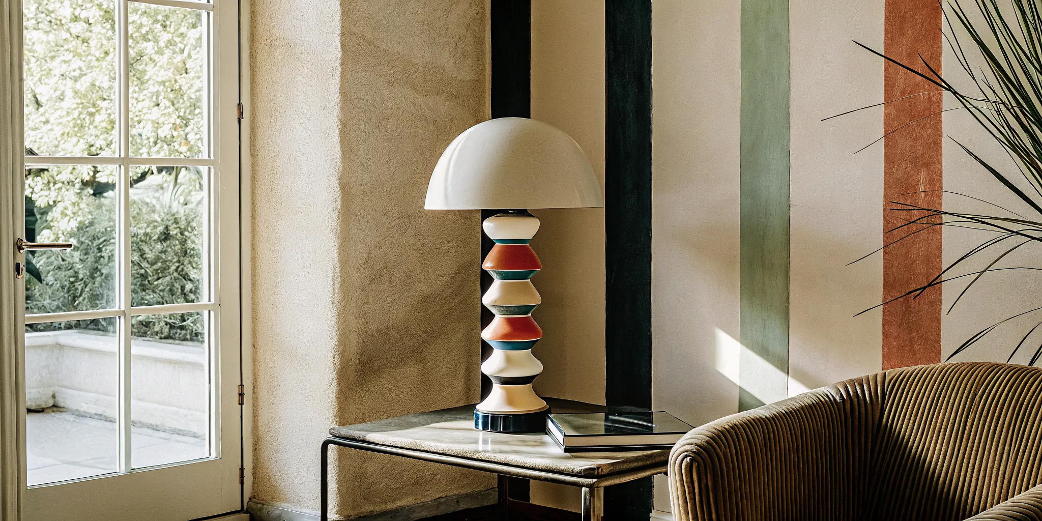
A single block of cobalt blue painted behind a simple shelf turns a blank wall into art. This playful method is the easiest way to give your home a high-design feeling without a massive budget.
Color blocking interior design is a bold styling technique that pairs large, solid blocks of contrasting hues to create eye-catching visual patterns in a room. This playful method goes beyond simple accent walls, using geometric shapes and clean lines to define distinct zones or highlight specific architectural features in your home. As the New York Institute of Art and Design explains, this popular approach relies on large sections of solid color to make a strong visual statement. To make this look work, you must balance these intense segments of color with calm neutral tones so the final design feels both exciting and comfortable. This balance creates a bright, joyful home that highlights your favorite sculptural lights.
Pre-order your Woaw lamp today and take the first step toward a home that is as playful and bold as you are.
If you want to bring this vibrant style into your home, knowing the basics of this design trend will help you plan with confidence. Let us begin by answering the core question: What Is Color Blocking in Interior Design?
Color Blocking Interior Design: What Is Color Blocking in Interior Design?
Color blocking in interior design involves using large, bold sections of solid color to create visual impact. This design method does not rely on soft shades or busy patterns. Instead, it pairs clean lines and solid colors to define each area in a room. Designers use this technique to bring strong vibes into your home.
Roots in Modern Art
This design style started long before it entered our homes. It has deep roots in the modern art movement of the early twentieth century. Dutch painter Piet Mondrian used solid blocks of red, yellow, and blue inside black lines. Today, designers put those same art ideas right onto the walls and floors of modern rooms. To see how these ideas come alive in lighting, check out the Woaw Lighting collection of sculptural lamps.
How It Differs from Normal Paint Schemes
Most rooms use standard color schemes with one main color and a few light accents. Color blocking stands out because it uses two or more bright, solid colors in equal amounts. The color wheel serves as a key tool for interior designers to create balanced palettes for color blocking. By looking at this wheel, you can see how these hues react to each other.
Designers use the wheel to pick colors that work well together. Some choose complementary colors that sit across from each other on the wheel, pairing opposite hues like deep blue and warm orange for high energy. Other designs use analogous colors that sit next to each other to make a quiet space. You can also pick triadic colors that form a triangle on the wheel.
Why It Is Surging in 2026
In 2026, more people want their homes to feel fun and full of joy. This has led to the rise of dopamine decor, which focuses on bright colors and playful shapes. Color blocking is a big part of this trend because it lets people show off their unique taste through bold hues. Sculptural, color-blocked lighting pieces also serve as perfect anchors for these happy rooms.
Adding these bold blocks of color to your home can feel like a big step. You do not have to paint all your walls to try this trend. Check out our guide to Dopamine Decor and Color-Blocking: Bold Home Design Ideas That Stick for the full deep dive. It has many simple tips to help you start color blocking interior design projects.
The Three Rules of Successful Color Blocking in a Room
Using large, bold sections of solid paint is a great way to change a space. When you use color blocking interior design techniques, you do not need to paint every wall. You can focus on small areas to make a big impact. But to make this work, you must follow some basic design rules.
To start, color blocking in interior design involves using large, bold sections of solid color to create visual impact. It is a simple tool with big style. But you must plan your palette with care to keep the room from feeling chaotic.
Core Design Rules
To make your design look its best, you should follow three core rules of color layout. These steps help ensure your color blocking project looks professional and polished.
- Pair opposites on the color wheel for energy. Complementary schemes pair colors directly opposite each other, such as blue and orange, to build high-contrast spaces.
- Balance color strength to avoid a messy look. You should mix bold blocks with more muted or neutral tones to help maintain visual balance in a room.
- Use the four-color adjacency rule when mapping your space. This rule states that you only need four colors in an abstract map to ensure no two touching blocks share the same hue.
How to Select Your Palette
To build a good palette, you can use the color wheel as your roadmap. It helps you see how hues relate to each other. When you know these links, you can choose colors that work well together instead of fighting. It is the best way to plan your design before you buy paint.
You must also look at color value and saturation, not just the hue itself. Value means how light or dark a color is, while saturation is how intense it is. A room with only bright, pure colors can feel too loud. But if you use softer, muted tones, the space will feel much more calm and relaxed.
Practical Setup Tips
If you are new to this style, you can start small. A good way to begin is with a monochromatic look. This means you use different values of just one single color in your room. It is safe, clean, and easy to set up.
You can also choose analogous colors. These are three to five neighboring hues on the wheel, like green and yellow-green. Using these neighboring hues helps create serene environments with subtle variation.
When you are ready to paint, use painter's tape to get clean lines. Crisp lines are key for a neat look. Tape off your sections and press the edges down tight before you paint. This stops color bleed and keeps your blocks looking sharp.
Before you paint a whole wall, you can try this technique on a smaller scale. You can apply color blocking principles to statement lamps or small pieces of furniture. This lets you see how colors look in your home before you paint a big space.
Getting started? The Woaw Collection's sculptural lamps make it easy to test these rules with a single statement piece, bringing instant personality and color to any space.
Color-Blocking with Furniture Versus Lighting: Where to Start
When you start with color blocking interior design, you face a choice. Do you paint a wall, buy a bright sofa, or choose a bold lamp? Each path has its own cost and commitment level. Some paths need deep pockets and a lot of planning. For most novices, starting small is the best way to test new designs without risking too much cash. Visit our gallery for real-world examples of color-blocked spaces that started with a single lamp.
The High Commitment of Furniture
Large furniture pieces are often the first thing people think of for color blocks. A bright blue couch makes a strong style statement. But these items cost a lot of money and are hard to move. If you change your mind next season, you must spend thousands of dollars to replace them. That is a heavy burden for a design novice.
Still, you can use these blocks to frame a room. Experts show that color blocking can highlight key furniture pieces and focus the eye. But if you make a mistake with a sofa, you are stuck with a large and costly problem. It is hard to hide a giant piece of furniture that does not match. So stylists suggest that you build your skills with smaller, easy-to-move objects first.
The Instant Impact of Design-Led Lighting
Lighting gives you the same bold reward as a sofa but with much less risk. A single bold lamp can draw the eye to a corner. You can move a table lamp to a new room in seconds. You can try a lamp in the bedroom, then move it to the living room if you want a change. This freedom lets you try new pairs of colors until you find the look that works for your home.
If you want to try this technique, you can apply color blocking principles to statement lamps. A single boldly color-blocked Woaw floor lamp can anchor an entire room scheme. These lamps use steel bodies and ceramic shades to deliver high style. They use integrated LEDs to shine bright light, which helps highlight the colors around them without costing a fortune.
A Side-by-Side Comparison of Choices
To help you decide where to start, here is a quick look at how these two design methods compare across key areas. This table highlights why lighting is often the best choice for your first project.
| Feature | Bold Furniture | Design-Led Lighting |
|---|---|---|
| Commitment level | High commitment | Low commitment |
| Average cost | $800 to $3,000 | $282 to $982 |
| Ease of change | Hard to move or swap | Very easy to move and swap |
| Visual impact | Massive and dominant | Sharp and focused |
How to Use the Woaw Candelabra Form as Your Color-Blocking Anchor Piece
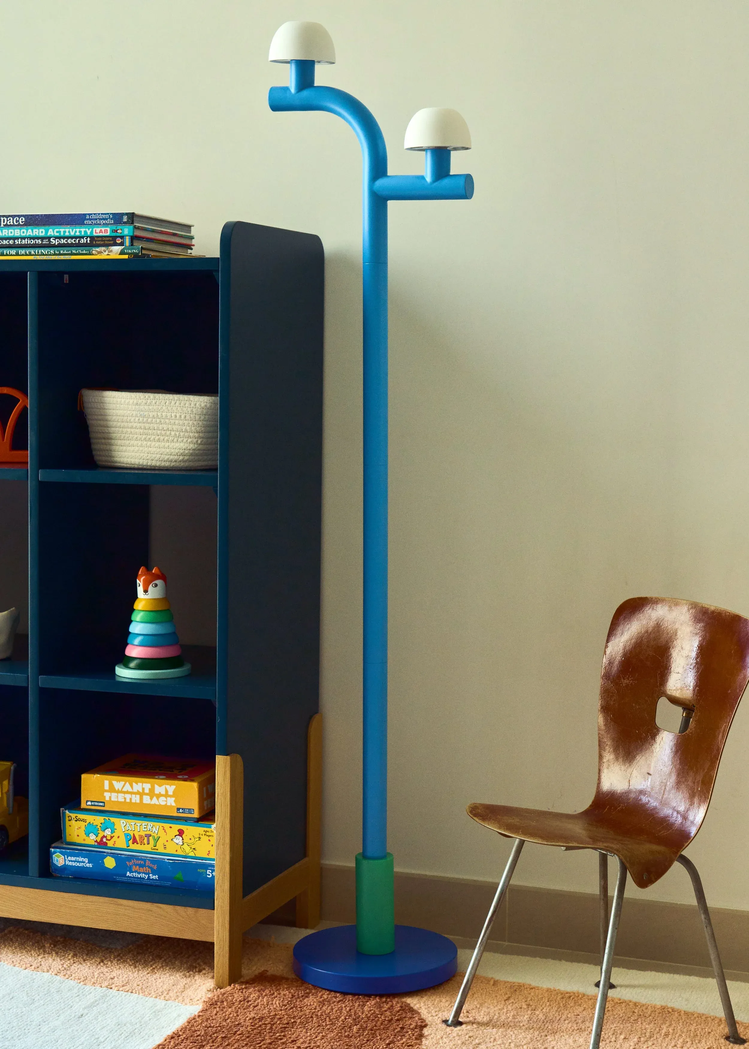
Every room needs a focal point that draws the eye. The Woaw Lighting Collection reimagines classic candelabra forms through a bold, toy-inspired lens. These boldly color-blocked lighting pieces serve as sculptural anchors. You can choose from three main shapes. The collection includes table lamps, floor lamps, and two-arm table lamps. Each shape uses strong lines and playful forms to stand out. They are not just lights; they are modern art.
When you plan a room, starting with a large item can feel scary. A statement lamp is a low-stress way to start. It lets you test bold tones before you paint a whole wall. These lamps work well for color blocking interior design because they have pre-set palettes. The design does the hard color work for you.
Sculptural Shapes to Anchor Your Space
The mix of metals and clay adds to their visual charm. Each piece pairs a sturdy steel body with fine ceramic shades. These parts allow for deep, rich colors that do not fade. You can find options in bold shades that contrast with each other. The lamp itself is a small, self-contained color block.
According to the New York Institute of Art and Design, color blocking can highlight specific furniture or lighting pieces within a room. A Woaw lamp does this by drawing the eye to its unique form. The contrast between the cold metal and warm ceramic makes the lamp pop. It acts as a sculptural center for your entire layout. Learn more on our About page to see how designer Nader Gammas brings these forms to life.
Steel Bodies and Ceramic Shades
To start your design, pick one lamp that matches your style. If you want a subtle start, a small table lamp works well on a side table. If you want a bold statement, a tall floor lamp can fill an empty corner. You can browse the Woaw Lighting collection to see all sizes and colors.
Once you select your lamp, use its colors to build the rest of your room. Match your rug, pillows, or curtains to the lamp shades. This creates a clean look without clutter. The collection offers table and wall lamps ranging from $282 to $491, while sculptural floor lamps are priced at $982. These pieces are ready for pre-order and ship within two months. This lead time gives you plenty of time to paint and prep your space. Place your order through the pre-order page to get started.
How to Build Your Room Around a Lamp
Here are three simple tips to anchor your room:
- Choose a table lamp for small spaces like shelves or desks.
- Use a floor lamp to light up dark corners and add extra height.
- Select opposite shades to make the color-blocking effect stand out.
Color-Blocking Palettes That Work in Real Homes
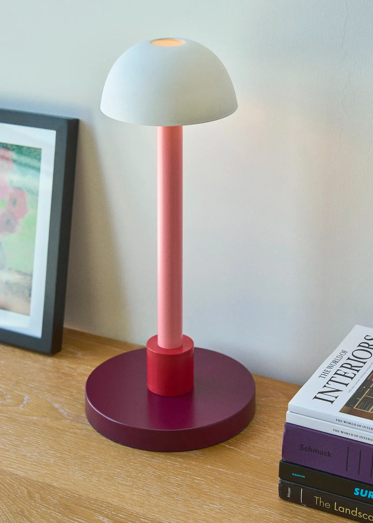
When you start to plan your space, choosing the right hues is key. Color blocking interior design does not mean painting every wall a bright main shade. Great rooms use careful planning to combine tones that fit your lifestyle. You can find real-world ideas in our gallery to see how these schemes look in practice. For complete product details, visit the Woaw Lighting Collection page.
The Balance of Saturation and Value
To create a balanced look, you must look at how bright or dark your paints are. Designers often study color theory in interior design to build schemes that feel calm. You must think of color value and saturation as well as hue when you paint your walls. Highly saturated tones can feel too loud if they cover every surface.
Using muted tones can help soften the look while keeping the design clean. You can mix bright blocks with soft neutrals to keep the room calm. For instance, a bright wall looks great when paired with a light beige or soft gray. This contrast makes your bold choices pop without making your eyes tired.
Five Color-Block Mixes for Your Home
You can use these five distinct palettes to bring this design trend into your home. Each mix offers a new mood and works well with statement pieces.
- Citrus Burst: Pair bright orange with lemon yellow and crisp white. This mix is high-energy and playful. A bright orange wall lamp from our Woaw collection fits this room well.
- Blue-and-Green Calm: Mix deep teal, sage green, and navy blue. This calm scheme uses neighboring hues and feels organic. It pairs perfectly with a teal small table lamp.
- Black-and-White Dramatic: Combine stark black, bright white, and neutral gray. This high-contrast look is clean and modern. Add a black two-arm table lamp to anchor the style.
- Pastel Play: Blend soft blush pink, light lavender, and pale mint green. These soft tones feel playful but gentle. They match a blush pink table lamp well.
- Monochrome Depth: Use a single hue, like deep forest green, in different values. This approach adds depth through light and dark versions of one color. Use a tall green floor lamp to complete the look.
Choosing Your Statement Lighting Anchor
Lamps are an easy way to add a pop of color to any room. You do not need to paint a whole wall to enjoy this style. A small table lamp or a bold wall light can serve as the starting point for your palette.
Our Woaw lamps are handcrafted with steel bodies and ceramic shades. These lamps have a sculptural feel that draws the eye. You can pre-order these lamps online through our ordering page, and they will ship to you within two months. They offer a simple way to add big style to your home.
Common Color-Blocking Mistakes and How to Avoid Them
This bold trend can make your home feel fresh and fun, but it also has traps for novices. Learn the common mistakes other people make before you start painting or buying bold items.
Color blocking interior design is a powerful tool, but a few missteps can turn a dynamic room into a chaotic one. The good news is that these mistakes are easy to avoid once you know what to look for.
Mistake 1: Going Too Bold Too Fast
The biggest mistake beginners make is painting an entire room in fully saturated primary colors. As the Interior Design Institute notes, a room painted entirely in fully saturated primaries would overwhelm most occupants. The fix is to start small. Begin with a single piece of furniture or a statement lamp, then build your palette from there. A monochromatic scheme using different values of one color is a safe and stylish starting point.
Mistake 2: Forgetting Neutral Anchors
Every bold color block needs a visual resting place. Without neutrals such as soft white, warm beige, or light gray, a color-blocked room can feel like a sensory overload. The New York Institute of Art and Design shows that even strong color-blocked vignettes work best when they include toned-down elements that coordinate with the bright blocks. Keep at least thirty percent of your room in neutral tones to give the eyes a place to rest. For more ideas, read our Woaw Lighting Collection buying guide to find the perfect anchor piece.
Mistake 3: Ignoring Lighting Temperature
The type of light in your room changes how color blocks read. Warm light (2700K to 3000K) softens bold colors, making reds and oranges feel cozy. Cool light (4000K to 5000K) makes blues and greens look crisp but can wash out warm tones. Always test your paint colors under both natural daylight and your room's artificial lighting before committing. A Woaw lamp with integrated LED lighting provides consistent, high-quality illumination that shows your color blocks in their true form.
Mistake 4: Overwhelming a Small Room
Small spaces can still use color blocking, but the scale matters. Large, aggressive blocks of dark color can make a tiny room feel like a box. Instead, use lighter hues and smaller color blocks to define zones within the space. A pastel palette or a single accent wall with a bold lamp is often enough to create impact without making the room feel cramped.
The easiest way to avoid all four mistakes? Start your color-blocking journey with a single Woaw lamp. It gives you a controlled pop of color that you can build around at your own pace.
Frequently Asked Questions About Color Blocking Interior Design
What is color-blocking in interior design?
Color blocking in interior design is a technique that uses large, solid sections of contrasting colors to create visual impact. Unlike traditional accent walls, color blocking uses geometric shapes and clean lines to divide a wall or room into distinct color zones. It draws inspiration from modern art, particularly the work of Piet Mondrian, and has become a defining feature of the dopamine decor trend.
Is color blocking still in style for 2026?
Yes, color blocking remains a strong trend in 2026. The rise of dopamine decor has fueled renewed interest in bold, joyful color combinations. Designers are moving beyond simple accent walls to embrace geometric color blocks, two-tone furniture, and sculptural lighting pieces that double as color-blocked art. The key is balancing bold blocks with neutral anchors for a polished look.
What are the rules for color blocking in a room?
Three core rules guide successful color blocking. First, use complementary colors (opposites on the color wheel) for energy or analogous colors (neighbors on the wheel) for calm. Second, balance bold saturated blocks with muted neutrals to prevent visual fatigue. Third, follow the four-color rule: when mapping abstract color blocks, four colors are enough to ensure no two touching sections share the same hue. Clean lines from painter's tape are also essential for a professional finish.
Should I start color blocking with furniture or lighting?
Lighting is the smarter starting point for most beginners. A sculptural lamp costs less than a sofa and can be moved from room to room if you change your mind. Woaw lamps from the Mr. John's Goods collection start at $282 and feature pre-designed color-blocked forms in steel and ceramic. Furniture color blocking is more permanent and expensive, making it a better choice once you have confidence in your palette choices.
How do I choose colors for a color-blocked room?
Start with the color wheel as your roadmap. Decide whether you want high-energy contrast (complementary colors like blue and orange) or serene harmony (analogous colors like teal and sage). Consider the saturation and value of each color. Test your choices on a small area first, ideally with a piece of decor like a lamp or a textile, before painting full walls. This reduces the risk of a costly mistake. For curated options, browse the Woaw Lighting Collection to see pre-matched color combinations.
Ready to Start Your Color-Blocking Journey?
You do not need to repaint an entire room to enjoy the energy of color blocking interior design. Start with a single statement piece that brings the whole concept to life. The Woaw Lighting Collection pairs bold steel bodies with warm ceramic shades in colors that work with any palette.
Pre-order your Woaw lamp today and take the first step toward a home that is as playful and bold as you are. Each piece ships within two months and arrives ready to brighten your space.